Friday, April 12, 2013

A Nike Lover's Heaven

'ello chaps!
Today is a lovely day... why is that? Because it is Friday!! Woot woot! Yesterday was the start of the last month of school I will (hopefully) ever be a part of! What a wonderful feeling! 

As school is dwindling down quickly, so is my motivation... to do anything. Which means I want to be doing nothing.

Oh well, I'm trying to push through and finish strong with continued hope and faith in my future and where it will take me!

So today I have brought you a wicked design of something that is near and dear to my heart... Shoes! (I promise I'm not shallow, I just said the 'near and dear' thing to be dramatic)!

Anyway, if you know me, you know I love shoes. Heels, boots and especially my nikes (pronounced like "likes" or 'pikes"... no "eeeee" at the end of nik-eeee... just nikes!)

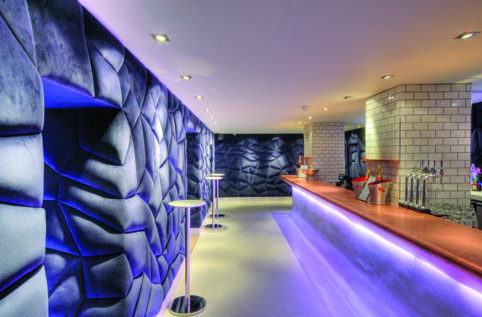
Now, if you are a shoe fanatic like myself, especially about Nikes, then you will have seen your fair share of Nike stores around the nation and world... they are pretty awesomely designed, agreed??

Well, I found possibly the most awesomely designed Nike store out there. Maybe many of you have already seen it, but I am so awestruck by this place that I needed the world to know!

Sooooo, I give you...., the Nike Store in Harajuku, Tokyo! 


Yes my friends, that is indeed a shoe chandelier!

This wonderful store utilizes the amazing designs of Masamichi Katayama (check out the website, so fun!)... Nike's first Tokyo flagship store is located in the style-magnet Harajuku district and was opened in late 2009. The designers took basically every element of the shoe and uniquely utilized it throughout the store to create a retail experience that screamed Nike. First example is above, the shoe chandelier, which features around 400 pairs of shiny white leather shoes that give off a glow from reflecting the lights surrounding it. 

What a focal point to the space!
(side note: I'm pretty sure the shoe chandelier has changed with time and trends... examples below of some alternative shoe chandeliers the store has had!)


Next are some of the walls that are featured throughout the store, which too boast elements of the Nike shoe.

These are black rubber soles that have been cut into square tiles ,
covering one of the store's walls
Waffle irons, similar to one's used on the first training shoe,
are a backdrop to some of the most high tech shoes in the store


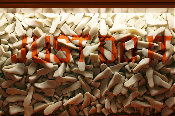
Behind the cash wrap of each floor (there are three floors of awesomeness!) there is a different piece of artwork featured. 

The first floor has the Nike "Just Do It" sign made out of Nike shoe molds.


The second floor features a shell-like rotation of the Nike high dunk shoes in all white (my favorite backdrop out of the whole store)...


And the third floor has a crest made from cleats...


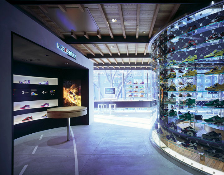
Besides these backdrops, there are subtle design features throughout the store that give the place it's Nike atmosphere... As I said, the store has three magnificent floors. The first floor is known as the Runners Studio. If you walk into the place and didn't know it's name, it's purpose is evident in the design, as seen in the pictures below. Notice the paper-like chandelier below... these are numbers that are used for runners in a race!

Notice the track lines on the floor....
Care to test out your shoe?

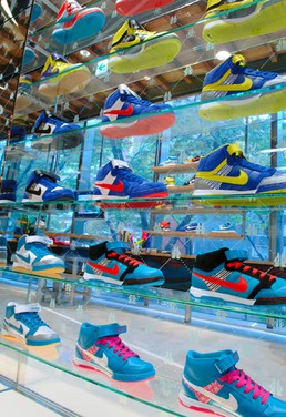
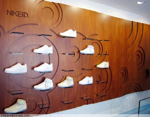
The second floor was mainly for NikeID, a customizable aspect of the company. Below are some pictures of this floor in the store.

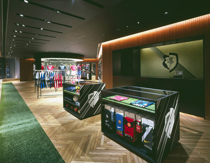
The third floor, The Boatroom, is solely (haha get it) dedicated to soccer, something only the Nike London store shares.

Staircase leading up to Boatroom


 Okay... lots of pictures but lots of awesome design as well! I would absolutely loooooove to go to this Nike store and just spend hours marveling at not only the awesome Nike merchandise, but the designs that were so thoughtfully integrated into the store.

I hope that you found this place just as awesome as I did and that you now have aspirations to visit it too!

Enjoy your weekend and week! Make someone smile today!

Much love,
- Taylor


Monday, April 8, 2013

Renovation Nation

Hello hello to my lovely readers!
I hope you all have had a wonderful weekend this past weekend! I had a wonderful week filled with old friends and new acquantinces!

So I'm just going to get right into this wonderful design because there is just so much to it! 

In my last blog, I talked a little about green design and how buildings can get ratings on how much they affect the environment and so on and so forth.. this can also happen with buildings that are being renovated. Not exactly saying that the building I'm showing you now has a LEED ranking, but the fact that a building is renovated versus creating a whole new structure does a lot for the environment in it of itself.

Warning: this blog will have a lot of pictures! There are so many aspects to this building that I love and that all contribute to the awesome design that I just have to get you as many pictures as possible!

Soooooo, I present, The Corinthian Club, located in Glasgow, Scotland!


The original building was actually built back in 1842 and was known as The Glasgow Ship Bank. It was one of the most ornate and elaborate buildings in the area at the time. Following an 8 month, multimillion dollar refurbishment, the newly renovated Corinthian Club opened it's doors in late August 2010. Hundreds of man-hours were spent in creating different aspects of the building, including a mosaic floor made of more than half a million tiles, over thousands of hand molded acanthus leaves, hand carved panels and restoring the ornate wooden features throughout the space.

There are so many rooms to this building and each room has been giving it's own specific amount of time and detail and nothing was missed as far as design and architecture are concerned. Led by Graven Images, the latest restoration has brought a touch of contemporary elegance to the buildings already wonderful architecture. The following images are from my favorite part of the building, though it is definitely hard to choose just one...

This area is known as the Tellers Bar and Brasserie....


This area is located on the ground floor and gives you the setting of the 'highest european standard' out there. The restaurant area states it "always serve the best quality liquid with an unfussy presentation while giving you some of the best breathtaking views". The kitchen offers the freshest, locally sourced produced that is cooked to order, not matter the time of day.

Does this not remind you of Alice in Wonderland??
Here is some more pictures of the area up close.. Don't you just adore the atmosphere and wish you could stop there for lunch today?? I sure do!


Next is the Boutique, also located on the ground floor. This is yet another area of the building you are able to dine at with a friend, group of friends, or a large party. Notice all the details put into meshing the wonderful architectural features (like the beautiful mirror like ceilings, large ornate chandeliers, and perfectly polished wood floors) of the building with the fabulously modern elements (such as the chairs, LED lights, and sleek glass tables. Simply Marvelous, Darling!


Looking for a place to hang out and drink some whiskey? The Bootleg specializes in the finest matured spirits from around the world, ranging from whisky to bourbon to rum and cognac. As the Club boasts, "Hard liquor for real men". Notice the difference between the boutique, which has a feminine demeanor, to that of the bootleg.

How would you like to install THAT huge mosaic with individual tiles? Yikes!


Yet another appealing area of the Corinthian Club is the Casino. Notice the heavy Greek influences (Corinthian to be exact, duh!) that are featured on in the fluted columns, the ornate barrel ceiling, and the molding on the balconies and above the columns!


And here are a few rooms that are also part of the Casino that branch out form the main area...


The rest of the pictures I will just put captions with because there are so many but they are too awesome to skimp on not showing you guys! Again, take a look at the way that old design has been perfectly meshed with the modern features of today!

Charlie Parkers, a bar with a difference

Charlie Parkers, enjoy late night live music performances in this piano bar
Langley, accommodates up to 60 guests for all types of occasions
Langley, has its own bar, state of the art sound system
as well as drop down screen and projector if needed
Mash & Press Rooms, mix and mingle with friends while enjoying
your choice of fine wine and specialty beers

Mash & Press Room, can be reserved in advance and are good
for informal group bookings

Club, has a private bar facility and is a late night destination
featuring the city's leading DJs every Friday and Saturday

Club, plays the very best Club Classics 
Whew! That was a lot of pictures! I do hope you took a little time to review all the design aspects of each room and recognized how truly awesome this design is! 2 more quick pictures.. look at these staircases and their designs!


Okay! That is all I have for you today! Like I say every time, I hope you found as much enjoyment out of this design as I have and that you are inspired by it's awesomeness!

I leave you now with two of my favorite quotes/challenges! Enjoy your week and I hope you are able to impact someone's life today in a positive way!

"What are you doing today that requires faith?"
        - Francis Chan, Crazy Love

"If the whole world were blind, how many people would you impress?"
        - Unknown


Have a happy happy day everyone! 
God Bless!

-T


Monday, April 1, 2013

Sunny Side Up

Goooooooood morning/afternoon/night my friends!

It's Taylor here, back to bring you some more innovative designs to your radar!

This is going to be a little bit of a shorter post compared to my last, as I realize after looking at previous posts, I write a lot! So for those of you that don't usually make it to the end of a long blog post, it's your lucky day!

Now, unless you've been chilling on a remote island or as some people may say "living under a rock", creating a 'greener' environment is the hottest trend, whether you actively participate or not. Now, green design has been around for awhile and is now exponentially picking up speed for many firms around the world. Many people are now just hearing about Green Design as it is something more and more people care about.

If you are wondering what exactly Green Design is, let me give you a brief.... very brief... lesson.

The USGBC (U.S. Green Building Council) is an organization that, every day, strives for a healthier, more sustainable and prosperous future through building design. They head up LEED (Leadership in Energy and Environmental Design), which is a market-driven program that provides third-party certification of green buildings... Now if that was just a jumble of words, the basics are this; there is a large checklist of items that a building has to fulfill in order to be granted certain ranks of how green the building is. Following are just a few things that LEED-certified buildings are designed to do:
  • Lower operating costs and increase property value
  • Reduce the amount of waste sent to landfills
  • Conserve energy and water
  • Be healthier and safer for occupants
  • Reduce harmful greenhouse gas emissions
  • many more!
For commercial buildings and neighborhoods, to earn LEED certification, a project must satisfy all LEED prerequisites and earn a minimum 40 points on a 110-point LEED rating system scale. Homes must earn a minimum of 45 points on a 136-point scale.

Buildings are given a silver, gold, or platinum rating, based on how many points the building earned.

Now I could go soooooooo much more in depth into LEED certification and Green Building Design, but I'm going to let you do more research on that if you desire. Here is the link >>USGBC<<.

Sooooo, FINALLY, to the design I have for you. This design, as far as I know, hasn't earned any LEED certification yet but it is still awesome design and green design non-the-less.

Presenting, United Chevron's Oil Station in Cerritos, CA by Kevin Oreck.


Now, if you're like me, then you think this is A+ awesome! But maybe this first glance at it doesn't do it much justice. I don't know about you, but whenever I'm on a road trip and stop at a gas station, it's pretty obvious to see whether a gas station's sole purpose is to pump gas and provide an icky toilet, or if it provides a stop that is pleasently and surprisingly nice and worth stopping by again.


Opting to accentuate rather than conceal specified solar panels, the Kevin Oreck Architect principal sandwiched photovoltaic cells between two layers of glass in the over-pump steel canopy, which casts faint light across the concrete, while amazingly generating 75 percent of the station’s electricity


The material theme seen on the canopy is also seen on the convenience store, which is fronted by panels of frosted and laminated glass, up-lit and folded in an alternating pattern to resemble a waterfall.


The above pictures give you a closer look at the exterior of the convenience store. Notice the "moat" that lines the front of the building? Who would have thought of putting so much detail into a convenience store?! It's like the store is creating a waterfall, ending in a pool of recycled water below.

 
Now walking in, the water-like theme is continued. Energy efficient tube lights line the ceiling, creating reflections on the concrete like floor and textured walls.


Part of the beauty of the station is the lack of branding throughout. The simple design solution gives it uniqueness that has even generated talk throughout the town of Cerritos to label it a work of art.

I know this post is a little out there, but I wanted to bring you something that was unexpected but still pretty awesome in it's design solution. Hopefully you found something that interested you in this blog post and it wasn't too long for your liking! Feel free to offer some suggestions and critique, I'd love to here it!
 
Have a glorious day and enjoy your April!
 
God bless,
 
-Taylor