Tuesday, February 19, 2013

Paper or Plastic?

Hello all!

I hope this post finds you happily fulfilling the wonderful plans you have made for the day!

While I sit gnawing obnoxiously on my fresh piece of gum (be thankful you aren't with me, I get pretty intense with my chewing gum), I wanted to bring another excellent design solution to your attention. The goal for this blog was to find design from around this world, which it still is, but today I have brought yet another design to you from the fabulous New York City. I just couldn't pass this up!

Now, architecture and design don't necessarily need to be found in an enclosed place, even if this appears to be the norm. There is design all over that is in fact mobile. The tricky part about this, though, is finding a way to stay creative and captivating while still being able to pick up and move that design to a new location.

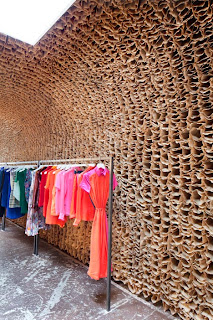
This, my friends, is exactly what I have found for you. With great honors, I present to you the retail store called Owen, which has been brilliantly designed by Tacklebox Architecture


Glancing at this quickly may lead one to conclude it is a simple and fairly monochromatic design with a bit of texture here and there. Do not be mistaken my friends... 

Let's look a little bit closer.


If you haven't figured out already, that is indeed the everyday brown paper lunch bag you see on the wall and ceiling, repeated thousands of times over (25,000 times to be exact)!

The design intent for this space was to create a temporary retail environment that stands as a physical introduction to the identity of this new brand. This store is the first in it's series and is a preview for stores to come.


Owen is in fact a fashion boutique located in the Meatpacking District of New York City. The 25,000 brown paper bag wall, arch, and ceiling took around 9 days to simply staple together. 


The repetition of the brown paper bags creates a honeycomb-like structure which gives the space a warm and organic volume. This, combined with the existing rustic brick and the concrete floors makes this a perfect store to be located in this weathered, industrial themed district of New York City. Along with these features, all clothing, accessories, and jewelry are displayed on quartz slab tables, blackened steel hang-bars, and steel and glass cases whose clean lines and modern look sit in contrast with the textures that surround it.


From the customer service to the (The OWEN training manual's first page reads, "Everyone that walks in the door should be treated like Beyonce) to the friendly inviting atmosphere. Salem aims to create, in a downtown environment, a luxurious shoping experience for all potential customers, whether they are Beyonce or not.

So there you have it folks, yet another crazy and innovative application of design that is found in the world around you. Sometimes the most compelling designs are done with the simplest of tools,s uch as the bag you brought your lunch in today. Design is about taking that crazy thought you think may work and making it a goal to see it through.

And now, I must leave you all as I have a date with some yummy Carlos O' Kelly's endless chips. Have a happy happy week and remember to never take advantage of the life you have been given. It's a darn awesome one, so never forget that!

Ta ta for now! Much love to everyone!


Friday, February 8, 2013

sh-Utter-ly Excellent

Welcome back friends (or hello hello to new visitors!)

I hope this past week has been wonderful for you and that you found a way to positively influence the lives of people around you!

This week has been quite busy and hectic for me as I am quickly, yet masterfully, am trying to complete my portfolio in order to start applying for some kick booty interior design internships this summer. It is quite stressful though... planning your future and growing up and things! Today, a girl in one of my classes, whom I hardly know, asked me if I just got done running. Apparently I didn't mask my lack of sleep or hygiene care well with my pre-wrap/ponytail/sweats combo today... fail! But despite this fail, I did get to go home for my little brother's basketball senior night and see a large portion of my extended family as well as see him dominate his last game at home.... soooo, this in itself trumps all fails:)

Needless to say, I welcome this weekend with a bottle of riesling wine I purchased at Trader Joes (their wine is so cheap and so good), a much needed "girls night' with longtime friends, and a beautiful, uninterrupted, peaceful sleep!

Anyway, as I digress, the design that sang to me this week happens to be in a place that is dear to my heart... Greece! I got the amazing opportunity during the summer of 2011 to go to Greece for a 3 week class. Greece as a whole is innovative design, just old innovation (oxymoron perhaps?) So many designs you see today derive from the architecture created in ancient Greece.

(picture of my awesome friends I met on the trip, me (with the white and black headband), the Parthenon behind us, and the sunset in front of us... awesomeness!)

But, my travels are beside the point... the design I have for you  is located in the lovely Athens, the heart of Greece. What I loved about Greece was how the old architecture of the city has been more or less left alone, despite the ruins that can be found unattractive to some with an untrained eye. But, contradicting that, I have found an awesome restaurant that has brought a new and modern twist to design in Greece.

Behold, Capanna by K-Studio. Capanna is a pizzeria located in the Kolonaki district, found in the center of Athens.

This restaurant finds itself in a prime location on the corner of two streets, one which has been designated for pedestrians only. The front door is intriguing enough to lure me in (I'm obsessed with cool doors!)

When great weather finds it's way into the city, which is often, the floor to ceiling windows are able to slide up and extend the restaurant to the pavement outside. 


The experience of eating outside was the inspiration that propelled this design. Since it is a pizzeria, the goal was to embody that of an Italian courtyard. To exemplify this, materials regularly found in such a courtyard were put into the space, such as cement tiles, stucco plaster, travertine stone, blackened steel railings, and characteristic narrow wooden shutters. These shutters are my favorite part of the design... take a look at the application of shutters throughout the space..


The shutters found in this restaurant remind me of all the awesome ways we have found to reuse wooden pallets (thank you Pinterest)! 

The design finds some aesthetically pleasing symmetry in the way the floor and wall (on the right in the picture below) are tied together through the terracotta motif tiles, as well as the wall and ceiling being tied together with the lining of shutters (on the left).


The rest of the features are quite minimalistic, such as the simple vintage chairs, cement tiled floors, and stucco plastered ceilings. I am also in love with the industrial styled pendants and the way they appear to defy gravity.

The combination of intentionally designed elements, reclaimed materials and vintage furniture and a new-to-location style of design has created an exciting and sociable atmosphere one would hardly forget!

I hope that this design is as exciting to you as it is to me! If not yet, I hope soon! Let me know if there is a type of design you would like to see, I'd love for some suggestions!

As I leave you with this design, I also want to challenge you this coming week to not stress, as I have expertly done these past 7 days. I am now taking a step back from everything and finding comfort in the fact that it isn't up to me and my timing and my plans for the future and I urge you to do the same! Relax and enjoy what has been given to you today!
(check out Luke 1:5-14)

Have a happy happy week everybody!

photography by  © Yiorgos Kordakis

Monday, February 4, 2013

Your Typical Design? I Don't Think So!

Before I get into this awesome design piece I have for you today, I wanted to explain a little bit about what interior design is and what us designers do. Now, don't feel bad if you are like a lot of the people who shrug off the ID major as just painting and finding soft carpets. This assumption is made quite often and is lightyears from the truth. Interior designers are like artists and engineers combined into one fabulously fantastic person with impeccable taste (I may be describing myself? hmmmm....). I recently came across a blog called Design Matters which highlights 10 reasons designers are important. Take the time to read this article and any other part of the blog as it is A+ awesome.

My favorite on the list is number 2, which is paraphrased as....
"Interior designers work improves the lives of others. They design for the homebody and the workerbee, in addition to the aged, handicapped, and infirm. Whether they add light to a dark interior or design a beautiful and healthy working space, they make a difference in the lives of others". 

Either way, I want you as a reader to appreciate the work of an interior designer, as well as an interior design student. If you are friends with somebody in an interior design program, you know exactly how much they are available during the school year. I swear I saw my roommates maybe 1 hour out of the week the year I entered into the design program.

All in all, in order to appreciate design a little more, I think it helps to appreciate the worker behind the magic in the space.. imagine the man hours and all-nighters and the pounds of coffee it takes to accomplish what you may first glance at as a simple project...

Now, that is all for my rant on how awesome us aspiring interior designers are:) Now onto the stuff that I promised would knock your toe socks right off!

Okay, so today as I was researching wonderful designs with my chai tea at hand, I came across this wicked coffee shop... done expertly by nemaworkshop, a firm located in New York City. (If you have the chance, look at the rest of their projects, it was hard to choose just one)!


This coffee shop, called D'espresso is a landmark in itself (awesome website too). The concept of this design, according to nemaworkshop, was to take the ordinary and turn it on its side.Since this coffee shop is located close to the New York Public Library in Bryant park, this design is genius. This project features tiles on the floor, wall, and ceiling with sepia-toned photographs of books printed on the tiles. Turn your head to the right and look at it as if the herringbone patterned wood on the left wall was actually the floor... pretty innovative huh? It in a way, it reminds me of Alice and Wonderland and when she is in the room where she shrinks... or gets bigger... not sure which one it is but you get the point! This design makes your imagination wander and this coffee shop unforgettable. 


If you are interested in a certain field of design and are searching for some awesome examples, let me know!

Sunday, February 3, 2013

Design. Playlists. Architecture. Music.

Hello all and welcome to my blog! I wanted to let you know from the start that this blog will be dedicated to the wonderful world of architecture and interior design!

No no no my friends, this is not another DIY blog or a suggestions-on-how-to-do-such-and-such... no, the goal of this blog is to bring innovative architecture into your radar that makes your eyes giddy with wonder and happiness, the same way music may excite and please the ears (thus, The Design Playlists, witty, right?!)

Before I dive too deep into this, I want to share a little about myself. I am currently an Interior Design student, soon to graduate this coming May (cross your fingers!) with a minor in marketing. I grew up in the Midwest in a college town where I was blessed to be within 20 minutes of the majority of my extended family. I don't know what outsiders think, but I feel like I had the best childhood growing up in the Midwest. I learned responsibility through showing horses in 4-H, hand eye coordination through catching fireflies in the backyard, and friendship through being honest and true to myself. Don't get me wrong though, I'm no small town girl, I just love the way I was brought up! In a few words, I am passionate about life, the people I'm blessed to know, and all the experiences that have gotten me thus far, good and bad. But back to my design goals.... What really drove me to be an interior design student was not only the endless possibilities of creativity, but the way that design can have such a positive impact on people. I love that through designing a space, you are able to make people feel comfortable, safe, and secure. My goals for the future are to someday be part of a company that strives to bring that type of joy and comfort into the users of their spaces.

Okay so back to the blog, enough about me! Through the series of posts to come, you will be seeing some kick booty architecture/design that will knock your toe socks right off! These following designs will be unique applications to both commercial and residential design that make it stand out from all the rest. Hopefully you won't be just wowed by these designs, but be motivated to look a little closer at the architecture around you and appreciate a little more what it is that I so passionately pursue!

So please, snuggle up in your blanket (here in the Midwest it's cold cold cold!), grab your large mug of hot chai tea, and join me in placing some wonderful and innovative architecture into your new Design Playlist!

More posts to come!